Radikally Different - Our World View

How to Choose Between a Responsive Design and a Mobile Website?
An essential part of positioning business presence is to project the right purpose and have true direction. The most debatable issue of the present times is whether to choose a responsive website or to have a mobile website platform. This is a matter of individual choice whether to have two separate identities for oneself but business move on right purposes and true directions. With mobile optimization becoming trendy pulling large web traffic is essential. Having a single website doing all the traffic magic is what is desirable.
Protection of Your Domain
Having a mobile website that has a different domain organic search volumes can get a beating. Website management becomes difficult as two separate content types have to be dealt with on two different websites. A responsive designed website works on its own domain. Complicated redirecting is eliminated. Search results on Google are improved for one website than for two websites.
Readying up for Future
With many mobile devices and technologies coming up maintaining a mobile website will be difficult as changes need to be made in server and data management for both entities. In a responsive form future programming is almost unnecessary as the technology running it is advanced. Future readiness is low in mobile websites as expense and high maintenance is present. Responsive websites are a better alternative for return on investment.
Flexibility
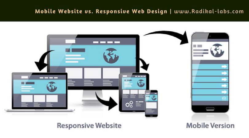
A responsive website allows users to have the website page fit right into the screen of their mobile device. The device’s screen size and visual orientation is put to use. A mobile website is a copy of the mother website. A server does the work in delivering an optimized page which is smaller and can be easily navigated. Mobile users can have a unique experience. The only thing that divides them both is cost. It will be steep to re-design a website into a responsive one but getting a new responsive website will incur no extra cost for site maintenance.
Read Also: Grow Your Business with Responsive Website Design
For Search Results
A separate domain used in a mobile website has web links shared on mobile browsers which do not form a part of the actual search results, search volumes and search trends on search engines like Google. The primary website will not be helpful with the mobile website. On a newly designed responsive website new codes are embedded. This saves the back links for your website and brings up the search results.
Future ready is one aspect that cannot be overlooked even if all other negative aspects of mobile website are bypassed. Bringing up one’s website traffic and being floated for a beneficial future is what every business looks for. Having a responsive design saves grace. An old website coming up with a responsive design is what we suggest for low to medium weighing websites. Websites needing extremely large, heavily functional and complex websites must see into all aspects of web designing and search analyses before deciding on any one of the two.
If you need help with going responsive or design mobile website, please contact us here http://www.radikal-labs.com/contact. Our developers and designers would be happy to help!
- Augmented Reality (4)
- Enterprise (9)
- Games (15)
- Marketing (17)
- Mobile App Development (26)
- Mobile Apps (19)
- Mobility Solutions (1)
- Monetization (8)
- News (16)
- Remote Hiring (1)
- Strategy (13)
- Testing (7)
- Uncategorized (1)
- User Experience (8)
- Virtual Reality (4)
- Web Browsing (1)
- Web Design & Development (20)